M’s Flower Catalogue app design
M’s Flower is a well know trendy flower shop have multiple stores located in metropolitan area. M’s Flower offers beautiful bouquets made by popular florists. They get busy especially when it’s event time like Mothers day, christmas time etc. M’s Flower targets customer like a worker who lack the time to visit and wait in long time to purchasing bouquet.
The Product:
Project duration:
February 2022 - April 2022
{Project overview}
When it’s an even time, the store gets very busy and customer as to wait for long in line.
Design M’s flowers app without losing the feeling of the trendiness that allow users easily pick bouquet and purchase without waiting.
The Problem:
The Goal:
UX designer designing an app for M’s flower from conception to delivery.
My role:
Conducting interviews
Paper and digital wireframing
Low and high-fidelity prototyping
Conducting usability studies
Accounting for accessibility
Iteration on designing.
Responsibilities:
TIME
{Understanding the user}
User research: summery
I conducted interview and empathy maps to understand the users I’m designing for and their needs. I identified through research that primary user group is adult who buys often bouquet and feels the bouquet is different from what they imaged. Also, pre-made bouquet in store has limited variation.
Interview also revealed that a lot of people compromise to order bouquet arranged for them not only time problem as well as language barrier, their mood and less knowledge of flowers.
User research: Pain point
IMAGE
When it’s event, flower shops are busy. People are also busy
Often there are gap between what they get and what they imaged.
To arrange the bouquet, you have to communicate with florist and some time people doesn’t like it.
Persona
Chris is a busy working man who needs a quick and easy way to order bouquetbecause he often takes long time to get bouquet for event time and bouquet is different from what he expected.
User journey map
COMMUNICATION
Mapping Chris’s user journey revealed how much helpful to have access to flower catalogue app which deliver to users.
{Starting the design}
Paper wireframes
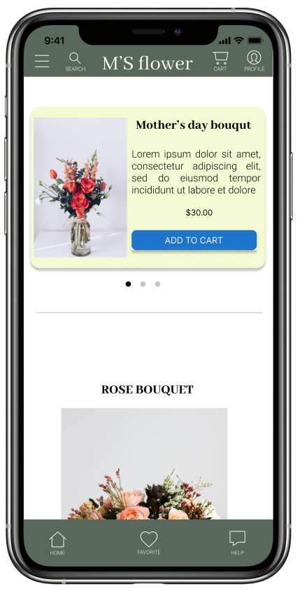
Taking the time to draft iteration of each screen of the app on paper ensured that the elements that made it to the digital wireframes would be well suited to address user pain points. For the home screen, I prioritized that simple design that make the beautiful bouquet picture stand out like a catalogue.
Stars were used to make elements of each sketch that would be used in the initial digital wireframes .
Digital wireframes 1
This top part can be quick access for users for specific seasonal product.
Button part can scroll down and see various bouquet. Each pictures are big enough to see details like a catalog and user can add to cart quick.
As a initial design phase, I made sure the screens are based on finding from user research.
Digital wireframes 2
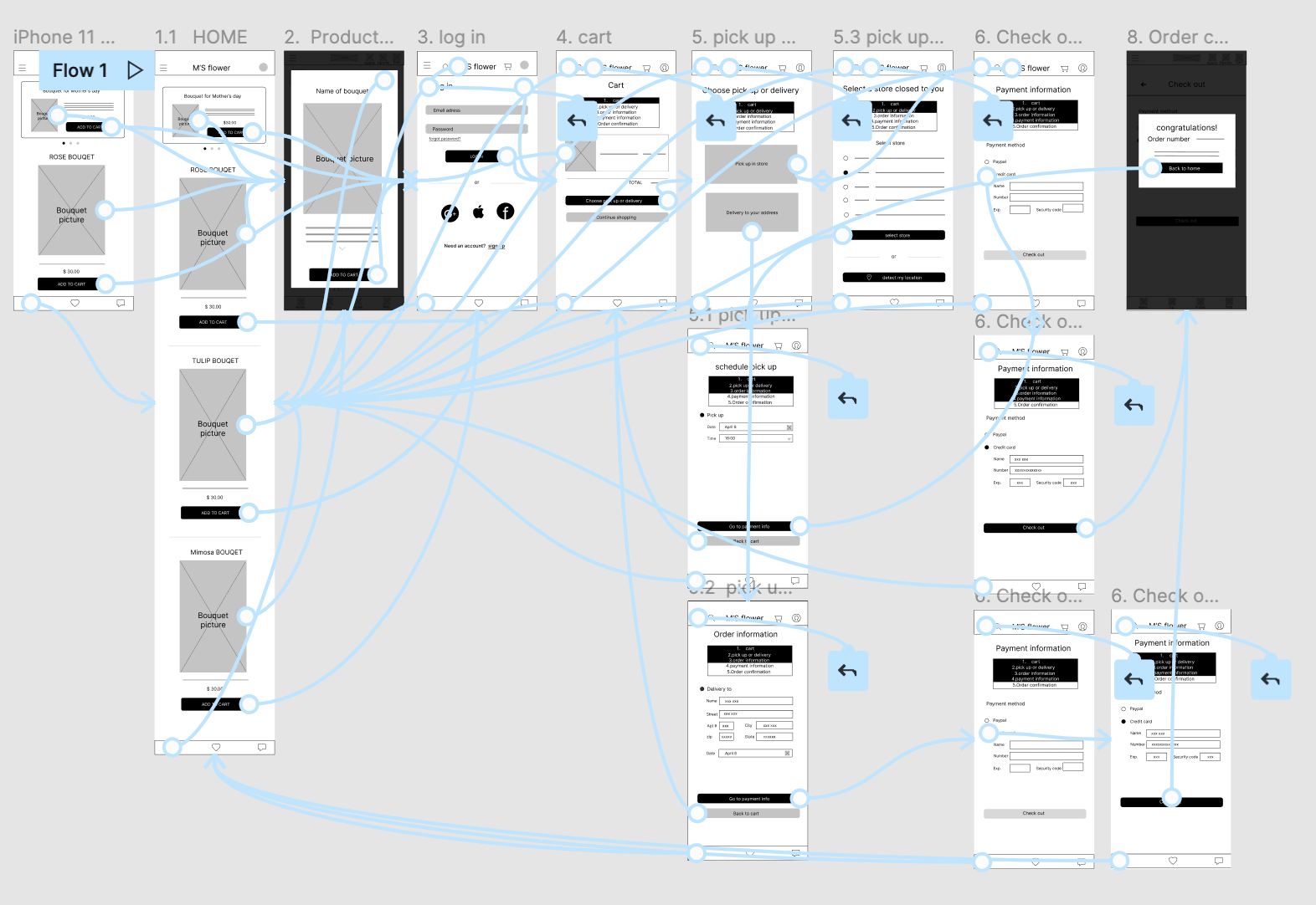
Easy to figure out where they are in the purchase step.
Easy navigation is the key to guide use to proceed the purchase quick and easy.
Low-fidelity prototype
Low-Fidelity prototype connect the primary user flow to purchase flower bouquet and user can choose pick up in store or delivery. So that prototype can be used in a usability study with users.
View M’s flower. : Low-fidelity prototype
Usability study: findings
I conducted two round of usability study. Finding from first study helped to guide from wireframe to mock up. Second study used high fidelity prototype and this revealed what aspect of the mock up needed refining and some new feature need to be added.
Round 1 Findings
Round 2 Findings
Users wants to have an order review page to avoid mistakes before check out.
Users want to select pick up date from calendar.
Users need more obvious button for shop without logging in.
Users want to add message card to bouquet when it’s a gift.
Users want to get reminder in advance to pick up and get delivery.
User want to select time frame instead of typing specific time.
{Refining the design}
Mockups After usability study 1
Before usability study, there was no order review page. After the study, I created new page to review all information of the order so that users can double check and feel comfortable to press check out button.
Mockups After usability study 2
After second round of usability study, it revealed that users want to add message card to the bouquet when it is a gift. I added the function to add message card and users can pick a card from multiple designs.
Key Mockups
High-fidelity prototype
The final high-fidelity prototype presented cleaner user flow to pick bouquet and purchase. It’s also met users needs for a pick up or delivery option as well as adding message card. Users can also see where they are in the purchase process.
View the M’s Flower app. High-fidelity prototype
Accessibility considerations
Use icons to help make navigation easier.
Used big and detailed multiple images of bouquet helps all users better understand the designs.
{Going Foward}
Impact:
What I learned:
The app makes users feel like M’s flower truly think about how to meet users needs.
During the design process, I have learned that how the UX work to design product and how research is important since each researches and studies bring new point of view to the designing process.
Next steps
Conduct another round of usability study to figure out whether pain points users experienced were effectively addressed.
Conduct more user research to determine t if there are any new area of need.


